
 ケケンタ
ケケンタヘッダーメニューの表示アニメーションを実装したい……
ケケンタサイト全体のナビゲーション効果を作りたい……
今回はこのようなお悩みをお持ちの方へ向けて
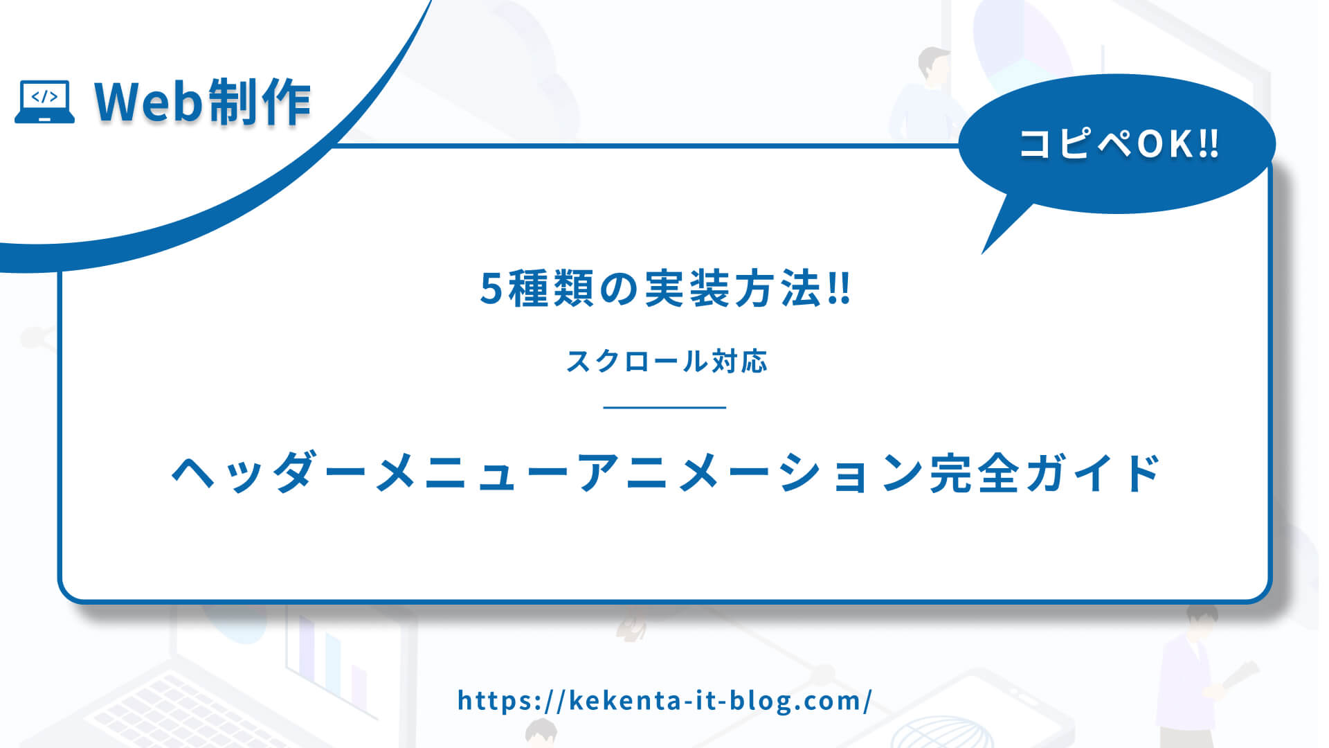
Web制作において人気の高いアニメーション効果
スクロール対応ヘッダーメニューアニメーション
をご紹介します。
- フェードイン(スクロール時の透明度変化)
- スライドダウン(スクロール時のスライド効果)
- スケール(スクロール時の拡大/縮小効果)
- スティッキー(スクロール時の固定表示)
- パララックス(スクロール時の視差効果)
 ケケンタ
ケケンタ特にサイト全体のナビゲーションには、スクロール対応ヘッダーメニューアニメーションが非常に効果的です。この記事のコードをご活用いただきWeb制作の効率化に繋がれば何よりです。
なお、今回ご紹介するアニメーションはCSSとJavaScriptを組み合わせて実装するので、スクロール位置に応じた動的なインタラクションを実現できます。
あわせて読みたい
Webアニメーションの引き出しを増やしたい人におすすめの書籍


もしプログラミング学習やお仕事で運動不足が気になっているなら
連続屈伸運動がおすすめです!
ボタンにカーソルを合わせるだけで
カウントダウンが始まるタイマーをご用意してみました!
ケケンタ無理のない範囲で、ぜひ隙間時間に屈伸運動を取り入れてみて下さい!
タイマースタート
3:00

スクロール対応ヘッダーメニューアニメーションとは
スクロール対応ヘッダーメニューアニメーションは、サイトのヘッダー部分にスクロール位置に応じて動的に変化するメニューの視覚的な効果です。ユーザーの注目を集め、スムーズなインタラクションを提供するための手法です。
効果的な使用場面
適している場面
- サイト全体のナビゲーション
- 企業サイト
- ポータルサイト
- ブログサイト
- ランディングページ
避けるべき場面
- モバイルサイト
- シンプルなサイト
- アクセシビリティを重視する場面
- 過度に使用した場合
実装方法の比較
| アニメーション | 難易度 | 視覚的インパクト | パフォーマンス | ブラウザ対応 |
|---|---|---|---|---|
| フェードイン | ⭐⭐⭐ | ⭐⭐⭐ | ⭐⭐⭐⭐ | ⭐⭐⭐⭐ |
| スライドダウン | ⭐⭐ | ⭐⭐⭐ | ⭐⭐⭐⭐ | ⭐⭐⭐⭐⭐ |
| スケール | ⭐⭐ | ⭐⭐⭐ | ⭐⭐⭐⭐ | ⭐⭐⭐⭐ |
| スティッキー | ⭐⭐ | ⭐⭐⭐ | ⭐⭐⭐⭐ | ⭐⭐⭐⭐⭐ |
| パララックス | ⭐⭐⭐ | ⭐⭐⭐⭐ | ⭐⭐⭐ | ⭐⭐⭐⭐ |
フェードイン
① デモ
See the Pen Untitled by ケケンタ (@lgshifbg-the-looper) on CodePen.
- スクロール時に初期ヘッダーが上にスライドして非表示
- アニメーションヘッダーがフェードインで表示
- スムーズな効果
- 視覚的インパクト中
- エレガントな印象
② HTML
<header class="header fade-in-header">
  <div class="header-container">
    <div class="logo">
      <a href="#">サイトロゴ</a>
    </div>
    <nav class="nav-menu">
      <ul class="nav-list">
        <li><a href="#" class="nav-link">ホーム</a></li>
        <li><a href="#" class="nav-link">サービス</a></li>
        <li><a href="#" class="nav-link">会社概要</a></li>
        <li><a href="#" class="nav-link">お問い合わせ</a></li>
      </ul>
    </nav>
  </div>
</header>

<main class="main-content">
  <section class="hero">
    <h1>メインコンテンツ</h1>
    <p>ここにメインコンテンツが入ります。</p>
  </section>

  <section class="content-section">
    <h2>コンテンツセクション1</h2>
    <p>スクロールするとヘッダーがフェードインアニメーションで表示されます。</p>
  </section>

  <section class="content-section">
    <h2>コンテンツセクション2</h2>
    <p>スクロール位置が100pxを超えるとヘッダーが表示されます。</p>
  </section>

  <section class="content-section">
    <h2>コンテンツセクション3</h2>
    <p>スクロールを続けるとヘッダーのアニメーション効果を確認できます。</p>
  </section>

  <section class="content-section">
    <h2>コンテンツセクション4</h2>
    <p>上にスクロールするとヘッダーが再び非表示になります。</p>
  </section>
</main>
③ CSS
* {
  margin: 0;
  padding: 0;
  box-sizing: border-box;
}

body {
  font-family: 'Arial', sans-serif;
  line-height: 1.6;
}

.header {
  position: fixed;
  top: 0;
  left: 0;
  right: 0;
  background: rgba(255, 255, 255, 0.95);
  backdrop-filter: blur(10px);
  -webkit-backdrop-filter: blur(10px);
  border-bottom: 1px solid rgba(0, 0, 0, 0.1);
  z-index: 1000;
  opacity: 1;
  transform: translateY(0);
  transition: all 0.3s ease;
}

.header.animated {
  opacity: 1;
  transform: translateY(0);
  background: rgba(102, 126, 234, 0.95);
  box-shadow: 0 2px 20px rgba(0, 0, 0, 0.1);
}

.header.scroll-up {
  opacity: 0;
  transform: translateY(-100%);
}

.header.fade-out {
  opacity: 0;
  transform: translateY(-100%);
}

.header.fade-in {
  opacity: 1;
  transform: translateY(0);
}

.header-container {
  max-width: 1200px;
  margin: 0 auto;
  padding: 0 20px;
  display: flex;
  justify-content: space-between;
  align-items: center;
  height: 70px;
}

.logo a {
  font-size: 24px;
  font-weight: bold;
  color: #333;
  text-decoration: none;
  transition: color 0.3s ease;
}

.logo a:hover {
  color: #667eea;
}

.nav-menu {
  display: flex;
  align-items: center;
}

.nav-list {
  list-style: none;
  display: flex;
  gap: 30px;
}

.nav-link {
  color: #333;
  text-decoration: none;
  font-weight: 500;
  padding: 10px 0;
  position: relative;
  transition: color 0.3s ease;
}

.nav-link:hover {
  color: #667eea;
}

.nav-link::after {
  content: '';
  position: absolute;
  bottom: 0;
  left: 0;
  width: 0;
  height: 2px;
  background: #667eea;
  transition: width 0.3s ease;
}

.nav-link:hover::after {
  width: 100%;
}

.main-content {
  margin-top: 70px;
}

.hero {
  height: 100vh;
  display: flex;
  flex-direction: column;
  justify-content: center;
  align-items: center;
  background: linear-gradient(135deg, #667eea 0%, #764ba2 100%);
  color: white;
  text-align: center;
  padding: 0 20px;
}

.hero h1 {
  font-size: 48px;
  margin-bottom: 20px;
}

.hero p {
  font-size: 18px;
  opacity: 0.9;
}

.content-section {
  padding: 100px 20px;
  text-align: center;
  background: #f8f9fa;
  min-height: 60vh;
}

.content-section:nth-child(even) {
  background: #ffffff;
}

.content-section h2 {
  font-size: 36px;
  margin-bottom: 20px;
  color: #333;
}

.content-section p {
  font-size: 18px;
  color: #666;
  max-width: 600px;
  margin: 0 auto;
  line-height: 1.6;
}
④ JavaScript
document.addEventListener('DOMContentLoaded', function() {
  const header = document.querySelector('.header');
  let isScrolled = false;

  window.addEventListener('scroll', function() {
    const scrollTop = window.pageYOffset || document.documentElement.scrollTop;

    if (scrollTop > 100 && !isScrolled) {
      // 初期ヘッダーを上にスライドして非表示
      header.classList.add('scroll-up');

      // 少し遅延させてアニメーションヘッダーをフェードイン
      setTimeout(() => {
        header.classList.remove('scroll-up');
        header.classList.add('animated');
      }, 300);

      isScrolled = true;
    } else if (scrollTop <= 100 && isScrolled) {
      // アニメーションヘッダーを上にフェードアウト
      header.classList.add('fade-out');
      header.classList.remove('animated');

      // 少し遅延させて初期ヘッダーをフェードイン
      setTimeout(() => {
        header.classList.remove('fade-out');
        header.classList.add('fade-in');

        // フェードイン完了後にクラスをクリア
        setTimeout(() => {
          header.classList.remove('fade-in');
        }, 300);
      }, 300);

      isScrolled = false;
    }
  });
});
⑤ カスタマイズ例
/* フェード速度の変更 */
.header {
  transition: all 0.5s ease;
}

/* アニメーションヘッダーの色変更 */
.header.animated {
  background: rgba(255, 193, 7, 0.95);
}

/* アニメーションヘッダーの方向変更 */
.header.animated {
  transform: translateY(0) scale(1.02);
}
/* スクロール閾値の変更 */
document.addEventListener('DOMContentLoaded', function() {
const header = document.querySelector('.header');
let isScrolled = false;
window.addEventListener('scroll', function() {
const scrollTop = window.pageYOffset || document.documentElement.scrollTop;
if (scrollTop > 200 && !isScrolled) { // 閾値を200pxに変更
header.classList.add('scroll-up');
setTimeout(() => {
header.classList.remove('scroll-up');
header.classList.add('animated');
}, 300);
isScrolled = true;
} else if (scrollTop <= 200 && isScrolled) {
header.classList.add('fade-out');
header.classList.remove('animated');
setTimeout(() => {
header.classList.remove('fade-out');
header.classList.add('fade-in');
setTimeout(() => {
header.classList.remove('fade-in');
}, 300);
}, 300);
isScrolled = false;
}
});
});スライドダウン
① デモ
See the Pen Untitled by ケケンタ (@lgshifbg-the-looper) on CodePen.
- スクロール時に初期ヘッダーが上にスライドして非表示
- アニメーションヘッダーが上から下にスライドダウンで表示
- 自然な動き
- 視覚的インパクト中
- 直感的な印象
② HTML
<header class="header slide-down-header">
  <div class="header-container">
    <div class="logo">
      <a href="#">サイトロゴ</a>
    </div>
    <nav class="nav-menu">
      <ul class="nav-list">
        <li><a href="#" class="nav-link">ホーム</a></li>
        <li><a href="#" class="nav-link">サービス</a></li>
        <li><a href="#" class="nav-link">会社概要</a></li>
        <li><a href="#" class="nav-link">お問い合わせ</a></li>
      </ul>
    </nav>
  </div>
</header>

<main class="main-content">
  <section class="hero">
    <h1>メインコンテンツ</h1>
    <p>ここにメインコンテンツが入ります。</p>
  </section>

  <section class="content-section">
    <h2>コンテンツセクション1</h2>
    <p>スクロールするとヘッダーがスライドダウンアニメーションで表示されます。</p>
  </section>

  <section class="content-section">
    <h2>コンテンツセクション2</h2>
    <p>スクロール位置が100pxを超えるとヘッダーが表示されます。</p>
  </section>

  <section class="content-section">
    <h2>コンテンツセクション3</h2>
    <p>スクロールを続けるとヘッダーのアニメーション効果を確認できます。</p>
  </section>

  <section class="content-section">
    <h2>コンテンツセクション4</h2>
    <p>上にスクロールするとヘッダーが再び非表示になります。</p>
  </section>
</main>
③ CSS
* {
  margin: 0;
  padding: 0;
  box-sizing: border-box;
}

body {
  font-family: 'Arial', sans-serif;
  line-height: 1.6;
}

.header {
  position: fixed;
  top: 0;
  left: 0;
  right: 0;
  background: rgba(255, 255, 255, 0.95);
  backdrop-filter: blur(10px);
  -webkit-backdrop-filter: blur(10px);
  border-bottom: 1px solid rgba(0, 0, 0, 0.1);
  z-index: 1000;
  transform: translateY(0);
  transition: all 0.3s ease;
}

.header.scroll-up {
  transform: translateY(-100%);
}

.header.animated {
  transform: translateY(0);
  background: rgba(102, 126, 234, 0.95);
  box-shadow: 0 2px 20px rgba(0, 0, 0, 0.1);
}

.header.slide-up {
  transform: translateY(-100%);
}

.header.slide-down {
  transform: translateY(0);
}

.header-container {
  max-width: 1200px;
  margin: 0 auto;
  padding: 0 20px;
  display: flex;
  justify-content: space-between;
  align-items: center;
  height: 70px;
}

.logo a {
  font-size: 24px;
  font-weight: bold;
  color: #333;
  text-decoration: none;
  transition: color 0.3s ease;
}

.logo a:hover {
  color: #667eea;
}

.nav-menu {
  display: flex;
  align-items: center;
}

.nav-list {
  list-style: none;
  display: flex;
  gap: 30px;
}

.nav-link {
  color: #333;
  text-decoration: none;
  font-weight: 500;
  padding: 10px 0;
  position: relative;
  transition: color 0.3s ease;
}

.nav-link:hover {
  color: #667eea;
}

.nav-link::after {
  content: '';
  position: absolute;
  bottom: 0;
  left: 0;
  width: 0;
  height: 2px;
  background: #667eea;
  transition: width 0.3s ease;
}

.nav-link:hover::after {
  width: 100%;
}

.main-content {
  margin-top: 70px;
}

.hero {
  height: 100vh;
  display: flex;
  flex-direction: column;
  justify-content: center;
  align-items: center;
  background: linear-gradient(135deg, #667eea 0%, #764ba2 100%);
  color: white;
  text-align: center;
  padding: 0 20px;
}

.hero h1 {
  font-size: 48px;
  margin-bottom: 20px;
}

.hero p {
  font-size: 18px;
  opacity: 0.9;
}

.content-section {
  padding: 100px 20px;
  text-align: center;
  background: #f8f9fa;
  min-height: 60vh;
}

.content-section:nth-child(even) {
  background: #ffffff;
}

.content-section h2 {
  font-size: 36px;
  margin-bottom: 20px;
  color: #333;
}

.content-section p {
  font-size: 18px;
  color: #666;
  max-width: 600px;
  margin: 0 auto;
  line-height: 1.6;
}
④ JavaScript
document.addEventListener('DOMContentLoaded', function() {
  const header = document.querySelector('.header');
  let isScrolled = false;

  window.addEventListener('scroll', function() {
    const scrollTop = window.pageYOffset || document.documentElement.scrollTop;

    if (scrollTop > 100 && !isScrolled) {
      // 初期ヘッダーを上にスライドして非表示
      header.classList.add('scroll-up');

      // 少し遅延させてアニメーションヘッダーをスライドダウン
      setTimeout(() => {
        header.classList.remove('scroll-up');
        header.classList.add('animated');
      }, 300);

      isScrolled = true;
    } else if (scrollTop <= 100 && isScrolled) {
      // アニメーションヘッダーを上にスライドアップ
      header.classList.add('slide-up');
      header.classList.remove('animated');

      // 少し遅延させて初期ヘッダーをスライドダウン
      setTimeout(() => {
        header.classList.remove('slide-up');
        header.classList.add('slide-down');

        // スライドダウン完了後にクラスをクリア
        setTimeout(() => {
          header.classList.remove('slide-down');
        }, 300);
      }, 300);

      isScrolled = false;
    }
  });
});
⑤ カスタマイズ例
/* スライド速度の変更 */
.header {
  transition: all 0.5s ease;
}

/* スライド距離の変更 */
.header.scroll-up {
  opacity: 0;
  transform: translateY(-50px);
}

/* アニメーションヘッダーの色変更 */
.header.animated {
  background: rgba(255, 193, 7, 0.95);
}
/* スクロール閾値の変更 */
document.addEventListener('DOMContentLoaded', function() {
const header = document.querySelector('.header');
let isScrolled = false;
window.addEventListener('scroll', function() {
const scrollTop = window.pageYOffset || document.documentElement.scrollTop;
if (scrollTop > 200 && !isScrolled) { // 閾値を200pxに変更
header.classList.add('scroll-up');
setTimeout(() => {
header.classList.remove('scroll-up');
header.classList.add('animated');
}, 300);
isScrolled = true;
} else if (scrollTop <= 200 && isScrolled) {
header.classList.add('slide-up');
header.classList.remove('animated');
setTimeout(() => {
header.classList.remove('slide-up');
header.classList.add('slide-down');
setTimeout(() => {
header.classList.remove('slide-down');
}, 300);
}, 300);
isScrolled = false;
}
});
});スケール
① デモ
See the Pen Untitled by ケケンタ (@lgshifbg-the-looper) on CodePen.
- アニメーションヘッダーがスケールアップで表示
- 一番上に戻るとアニメーションヘッダーがスケールダウン
- 動的な効果
- 視覚的インパクト大
- モダンな印象
② HTML
<header class="header scale-header">
  <div class="header-container">
    <div class="logo">
      <a href="#">サイトロゴ</a>
    </div>
    <nav class="nav-menu">
      <ul class="nav-list">
        <li><a href="#" class="nav-link">ホーム</a></li>
        <li><a href="#" class="nav-link">サービス</a></li>
        <li><a href="#" class="nav-link">会社概要</a></li>
        <li><a href="#" class="nav-link">お問い合わせ</a></li>
      </ul>
    </nav>
  </div>
</header>

<main class="main-content">
  <section class="hero">
    <h1>メインコンテンツ</h1>
    <p>ここにメインコンテンツが入ります。</p>
  </section>

  <section class="content-section">
    <h2>コンテンツセクション1</h2>
    <p>スクロールするとヘッダーがスケールアニメーションで表示されます。</p>
  </section>

  <section class="content-section">
    <h2>コンテンツセクション2</h2>
    <p>スクロール位置が100pxを超えるとヘッダーが表示されます。</p>
  </section>

  <section class="content-section">
    <h2>コンテンツセクション3</h2>
    <p>スクロールを続けるとヘッダーのアニメーション効果を確認できます。</p>
  </section>

  <section class="content-section">
    <h2>コンテンツセクション4</h2>
    <p>上にスクロールするとヘッダーが再び非表示になります。</p>
  </section>
</main>
③ CSS
* {
  margin: 0;
  padding: 0;
  box-sizing: border-box;
}

body {
  font-family: 'Arial', sans-serif;
  line-height: 1.6;
}

.header {
  position: fixed;
  top: 0;
  left: 0;
  right: 0;
  background: rgba(255, 255, 255, 0.95);
  backdrop-filter: blur(10px);
  -webkit-backdrop-filter: blur(10px);
  border-bottom: 1px solid rgba(0, 0, 0, 0.1);
  z-index: 1000;
  opacity: 1;
  transform: translateY(0);
  transition: all 0.3s ease;
}

.header.scroll-up {
  opacity: 0;
  transform: translateY(-100%);
}

.header.scale-in {
  opacity: 0;
  transform: translateY(0) scale(0.8);
}

.header.animated {
  opacity: 1;
  transform: translateY(0) scale(1);
  background: rgba(102, 126, 234, 0.95);
  box-shadow: 0 2px 20px rgba(0, 0, 0, 0.1);
}

.header.scale-down {
  opacity: 0;
  transform: translateY(0) scale(0.8);
}

.header.scale-up {
  opacity: 1;
  transform: translateY(0) scale(1);
}

.header-container {
  max-width: 1200px;
  margin: 0 auto;
  padding: 0 20px;
  display: flex;
  justify-content: space-between;
  align-items: center;
  height: 70px;
}

.logo a {
  font-size: 24px;
  font-weight: bold;
  color: #333;
  text-decoration: none;
  transition: color 0.3s ease;
}

.logo a:hover {
  color: #667eea;
}

.nav-menu {
  display: flex;
  align-items: center;
}

.nav-list {
  list-style: none;
  display: flex;
  gap: 30px;
}

.nav-link {
  color: #333;
  text-decoration: none;
  font-weight: 500;
  padding: 10px 0;
  position: relative;
  transition: color 0.3s ease;
}

.nav-link:hover {
  color: #667eea;
}

.nav-link::after {
  content: '';
  position: absolute;
  bottom: 0;
  left: 0;
  width: 0;
  height: 2px;
  background: #667eea;
  transition: width 0.3s ease;
}

.nav-link:hover::after {
  width: 100%;
}

.main-content {
  margin-top: 70px;
}

.hero {
  height: 100vh;
  display: flex;
  flex-direction: column;
  justify-content: center;
  align-items: center;
  background: linear-gradient(135deg, #667eea 0%, #764ba2 100%);
  color: white;
  text-align: center;
  padding: 0 20px;
}

.hero h1 {
  font-size: 48px;
  margin-bottom: 20px;
}

.hero p {
  font-size: 18px;
  opacity: 0.9;
}

.content-section {
  padding: 100px 20px;
  text-align: center;
  background: #f8f9fa;
  min-height: 60vh;
}

.content-section:nth-child(even) {
  background: #ffffff;
}

.content-section h2 {
  font-size: 36px;
  margin-bottom: 20px;
  color: #333;
}

.content-section p {
  font-size: 18px;
  color: #666;
  max-width: 600px;
  margin: 0 auto;
  line-height: 1.6;
}
④ JavaScript
document.addEventListener('DOMContentLoaded', function() {
  const header = document.querySelector('.header');
  let isScrolled = false;

  window.addEventListener('scroll', function() {
    const scrollTop = window.pageYOffset || document.documentElement.scrollTop;

    if (scrollTop > 100 && !isScrolled) {
      // 初期ヘッダーを上にスライドして非表示
      header.classList.add('scroll-up');

      // 少し遅延させてアニメーションヘッダーをスケールイン
      setTimeout(() => {
        header.classList.remove('scroll-up');
        header.classList.add('scale-in');

        // さらに遅延させてスケールアップ
        setTimeout(() => {
          header.classList.remove('scale-in');
          header.classList.add('animated');
        }, 100);
      }, 300);

      isScrolled = true;
    } else if (scrollTop <= 100 && isScrolled) {
      // アニメーションヘッダーをスケールダウン
      header.classList.add('scale-down');
      header.classList.remove('animated');

      // 少し遅延させて初期ヘッダーをスケールアップ
      setTimeout(() => {
        header.classList.remove('scale-down');
        header.classList.add('scale-up');

        // スケールアップ完了後にクラスをクリア
        setTimeout(() => {
          header.classList.remove('scale-up');
        }, 300);
      }, 300);

      isScrolled = false;
    }
  });
});
⑤ カスタマイズ例
/* スケール速度の変更 */
.header {
  transition: all 0.5s ease;
}

/* スケール比率の変更 */
.header.animated {
  transform: translateY(0) scale(1.1);
}

/* アニメーションヘッダーの色変更 */
.header.animated {
  background: rgba(255, 193, 7, 0.95);
}
/* スクロール閾値の変更 */
document.addEventListener('DOMContentLoaded', function() {
const header = document.querySelector('.header');
let isScrolled = false;
window.addEventListener('scroll', function() {
const scrollTop = window.pageYOffset || document.documentElement.scrollTop;
if (scrollTop > 200 && !isScrolled) { // 閾値を200pxに変更
header.classList.add('scroll-up');
setTimeout(() => {
header.classList.remove('scroll-up');
header.classList.add('scale-in');
setTimeout(() => {
header.classList.remove('scale-in');
header.classList.add('animated');
}, 100);
}, 300);
isScrolled = true;
} else if (scrollTop <= 200 && isScrolled) {
header.classList.add('scale-down');
header.classList.remove('animated');
setTimeout(() => {
header.classList.remove('scale-down');
header.classList.add('scale-up');
setTimeout(() => {
header.classList.remove('scale-up');
}, 300);
}, 300);
isScrolled = false;
}
});
});スティッキー
① デモ
See the Pen ヘッダーアニメーションスティッキー by ケケンタ (@lgshifbg-the-looper) on CodePen.
- 固定表示
- シンプルな効果
- 視覚的インパクト小
- 実用的な印象
② HTML
<header class="header sticky-header">
  <div class="header-container">
    <div class="logo">
      <a href="#">サイトロゴ</a>
    </div>
    <nav class="nav-menu">
      <ul class="nav-list">
        <li><a href="#" class="nav-link">ホーム</a></li>
        <li><a href="#" class="nav-link">サービス</a></li>
        <li><a href="#" class="nav-link">会社概要</a></li>
        <li><a href="#" class="nav-link">お問い合わせ</a></li>
      </ul>
    </nav>
  </div>
</header>

<main class="main-content">
  <section class="hero">
    <h1>メインコンテンツ</h1>
    <p>ここにメインコンテンツが入ります。</p>
  </section>
  <section class="content">
    <h2>コンテンツセクション</h2>
    <p>スクロールするとヘッダーが固定されます。</p>
  </section>
</main>
③ CSS
* {
  margin: 0;
  padding: 0;
  box-sizing: border-box;
}

body {
  font-family: 'Arial', sans-serif;
  line-height: 1.6;
}

.header {
  position: fixed;
  top: 0;
  left: 0;
  right: 0;
  background: rgba(255, 255, 255, 0.95);
  backdrop-filter: blur(10px);
  -webkit-backdrop-filter: blur(10px);
  border-bottom: 1px solid rgba(0, 0, 0, 0.1);
  z-index: 1000;
  transition: all 0.3s ease;
}

.header.scrolled {
  background: rgba(255, 255, 255, 0.98);
  box-shadow: 0 2px 20px rgba(0, 0, 0, 0.1);
}

.header-container {
  max-width: 1200px;
  margin: 0 auto;
  padding: 0 20px;
  display: flex;
  justify-content: space-between;
  align-items: center;
  height: 70px;
}

.logo a {
  font-size: 24px;
  font-weight: bold;
  color: #333;
  text-decoration: none;
  transition: color 0.3s ease;
}

.logo a:hover {
  color: #667eea;
}

.nav-menu {
  display: flex;
  align-items: center;
}

.nav-list {
  list-style: none;
  display: flex;
  gap: 30px;
}

.nav-link {
  color: #333;
  text-decoration: none;
  font-weight: 500;
  padding: 10px 0;
  position: relative;
  transition: color 0.3s ease;
}

.nav-link:hover {
  color: #667eea;
}

.nav-link::after {
  content: '';
  position: absolute;
  bottom: 0;
  left: 0;
  width: 0;
  height: 2px;
  background: #667eea;
  transition: width 0.3s ease;
}

.nav-link:hover::after {
  width: 100%;
}

.main-content {
  margin-top: 70px;
}

.hero {
  height: 100vh;
  display: flex;
  flex-direction: column;
  justify-content: center;
  align-items: center;
  background: linear-gradient(135deg, #667eea 0%, #764ba2 100%);
  color: white;
  text-align: center;
  padding: 0 20px;
}

.hero h1 {
  font-size: 48px;
  margin-bottom: 20px;
}

.hero p {
  font-size: 18px;
  opacity: 0.9;
}

.content {
  padding: 100px 20px;
  text-align: center;
  background: #f8f9fa;
}

.content h2 {
  font-size: 36px;
  margin-bottom: 20px;
  color: #333;
}

.content p {
  font-size: 18px;
  color: #666;
  max-width: 600px;
  margin: 0 auto;
}
④ カスタマイズ例
/* スティッキー効果の変更 */
.header.scrolled {
  background: rgba(102, 126, 234, 0.95);
}

.header.scrolled .nav-link {
  color: white;
}

/* スティッキー速度の変更 */
.header {
  transition: all 0.5s ease;
}

/* スティッキー高さの変更 */
.header-container {
  height: 60px;
}
パララックス
① デモ
See the Pen ヘッダーアニメーションパララックス by ケケンタ (@lgshifbg-the-looper) on CodePen.
- スクロール時にヘッダーが視差効果で上に移動
- ヒーローコンテンツが視差効果で下に移動
- スクロール量に応じて動的に変化
- 奥行き感のある3D的な空間演出
- 動的な効果
- 視覚的インパクト大
- 高級感のある印象
② HTML
<header class="header parallax-header">
  <div class="header-container">
    <div class="logo">
      <a href="#">サイトロゴ</a>
    </div>
    <nav class="nav-menu">
      <ul class="nav-list">
        <li><a href="#" class="nav-link">ホーム</a></li>
        <li><a href="#" class="nav-link">サービス</a></li>
        <li><a href="#" class="nav-link">会社概要</a></li>
        <li><a href="#" class="nav-link">お問い合わせ</a></li>
      </ul>
    </nav>
  </div>
</header>

<main class="main-content">
  <section class="hero parallax-hero">
    <div class="hero-content">
      <h1>メインコンテンツ</h1>
      <p>ここにメインコンテンツが入ります。</p>
    </div>
  </section>

  <section class="content-section">
    <h2>コンテンツセクション1</h2>
    <p>スクロールするとヘッダーとコンテンツが視差効果で動きます。</p>
  </section>

  <section class="content-section">
    <h2>コンテンツセクション2</h2>
    <p>ヘッダーは上に、コンテンツは下に移動する視差効果です。</p>
  </section>

  <section class="content-section">
    <h2>コンテンツセクション3</h2>
    <p>スクロール量に応じて動的に変化する3D的な空間演出です。</p>
  </section>

  <section class="content-section">
    <h2>コンテンツセクション4</h2>
    <p>奥行き感のある魅力的なアニメーション効果を体験できます。</p>
  </section>
</main>
③ CSS
* {
  margin: 0;
  padding: 0;
  box-sizing: border-box;
}

body {
  font-family: 'Arial', sans-serif;
  line-height: 1.6;
}

.header {
  position: fixed;
  top: 0;
  left: 0;
  right: 0;
  background: rgba(255, 255, 255, 0.95);
  backdrop-filter: blur(10px);
  -webkit-backdrop-filter: blur(10px);
  border-bottom: 1px solid rgba(0, 0, 0, 0.1);
  z-index: 1000;
  transition: all 0.3s ease;
  transform: translateY(0);
}

.header.parallax {
  transform: translateY(-50px);
  background: rgba(102, 126, 234, 0.95);
  box-shadow: 0 2px 20px rgba(0, 0, 0, 0.1);
}

.header-container {
  max-width: 1200px;
  margin: 0 auto;
  padding: 0 20px;
  display: flex;
  justify-content: space-between;
  align-items: center;
  height: 70px;
}

.logo a {
  font-size: 24px;
  font-weight: bold;
  color: #333;
  text-decoration: none;
  transition: color 0.3s ease;
}

.logo a:hover {
  color: #667eea;
}

.nav-menu {
  display: flex;
  align-items: center;
}

.nav-list {
  list-style: none;
  display: flex;
  gap: 30px;
}

.nav-link {
  color: #333;
  text-decoration: none;
  font-weight: 500;
  padding: 10px 0;
  position: relative;
  transition: color 0.3s ease;
}

.nav-link:hover {
  color: #667eea;
}

.nav-link::after {
  content: '';
  position: absolute;
  bottom: 0;
  left: 0;
  width: 0;
  height: 2px;
  background: #667eea;
  transition: width 0.3s ease;
}

.nav-link:hover::after {
  width: 100%;
}

.main-content {
  margin-top: 0;
}

.hero {
  height: 100vh;
  background: linear-gradient(135deg, #667eea 0%, #764ba2 100%);
  position: relative;
  overflow: hidden;
}

.hero-content {
  position: absolute;
  top: 50%;
  left: 50%;
  transform: translate(-50%, -50%);
  text-align: center;
  color: white;
  z-index: 2;
}

.hero h1 {
  font-size: 48px;
  margin-bottom: 20px;
  transform: translateY(0);
  transition: transform 0.3s ease;
}

.hero p {
  font-size: 18px;
  opacity: 0.9;
  transform: translateY(0);
  transition: transform 0.3s ease;
}

.hero.parallax h1 {
  transform: translateY(-60px);
}

.hero.parallax p {
  transform: translateY(-40px);
}

.content-section {
  padding: 100px 20px;
  text-align: center;
  background: #f8f9fa;
  min-height: 60vh;
}

.content-section:nth-child(even) {
  background: #ffffff;
}

.content-section h2 {
  font-size: 36px;
  margin-bottom: 20px;
  color: #333;
}

.content-section p {
  font-size: 18px;
  color: #666;
  max-width: 600px;
  margin: 0 auto;
  line-height: 1.6;
}


### ④ JavaScript
④ JavaScript
document.addEventListener('DOMContentLoaded', function() {
  const header = document.querySelector('.header');
  const hero = document.querySelector('.hero');
  const heroContent = document.querySelector('.hero-content');

  window.addEventListener('scroll', function() {
    const scrollTop = window.pageYOffset || document.documentElement.scrollTop;

    // ヘッダーの視差効果(上に移動)
    const headerParallax = scrollTop * 0.3;
    header.style.transform = `translateY(-${headerParallax}px)`;

    // ヒーローコンテンツの視差効果(下に移動)
    const heroParallax = scrollTop * 0.5;
    heroContent.style.transform = `translate(-50%, calc(-50% + ${heroParallax}px))`;

    // スクロール量に応じてヘッダーの背景色を変化
    if (scrollTop > 100) {
      header.style.background = `rgba(102, 126, 234, ${0.95 - scrollTop * 0.001})`;
      header.style.boxShadow = `0 2px 20px rgba(0, 0, 0, ${0.1 + scrollTop * 0.0005})`;
    } else {
      header.style.background = 'rgba(255, 255, 255, 0.95)';
      header.style.boxShadow = 'none';
    }
  });
});
⑤ カスタマイズ例
/* パララックス速度の変更 */
.header {
  transition: all 0.1s ease; /* より滑らかな動き */
}

/* パララックス方向の変更 */
.hero-content {
  transform: translate(-50%, -50%) rotate(${scrollTop * 0.1}deg);
}

/* パララックス効果の変更 */
.header {
  transform: translateY(-${scrollTop * 0.5}px) scale(${1 - scrollTop * 0.0001});
}
/* より動的なパララックス効果 */
document.addEventListener('DOMContentLoaded', function() {
const header = document.querySelector('.header');
const heroContent = document.querySelector('.hero-content');
window.addEventListener('scroll', function() {
const scrollTop = window.pageYOffset || document.documentElement.scrollTop;
// より大きな視差効果
const headerParallax = scrollTop * 0.5;
const heroParallax = scrollTop * 0.8;
header.style.transform = `translateY(-${headerParallax}px)`;
heroContent.style.transform = `translate(-50%, calc(-50% + ${heroParallax}px))`;
});
});まとめ
今回ご紹介したスクロール対応ヘッダーメニューアニメーションは、Webサイトのユーザーエクスペリエンスを向上させる重要な要素です。
実装のコツ
- 適切なアニメーション時間(300ms〜500ms)
- スムーズなイージング関数の使用
- スクロール閾値の適切な設定(100px〜200px)
- デスクトップデバイスでの動作確認
- アクセシビリティの配慮
- パフォーマンスの最適化
避けるべきポイント
- 過度に複雑なアニメーション
- 長すぎるアニメーション時間
- 読みにくい色の組み合わせ
- パフォーマンスを考慮しない実装
- 過度な使用
おすすめの組み合わせ
- 企業サイト: フェードイン、スティッキー
- ポータルサイト: スライドダウン、パララックス
- ブログサイト: スケール、スティッキー
ケケンタ特にサイト全体のナビゲーションでは、スクロールに応じたヘッダーメニューアニメーションがユーザーエクスペリエンスを大きく左右します。この記事のコードをご活用いただき、より魅力的なWebサイトの制作に繋がれば何よりです。
あわせて読みたい
もっと効率的にWeb制作を学びたい方へ
Web制作の学習は楽しいものですが、一人で進めていると「これで合っているのかな?」と不安になることもありますよね。
僕も独学でWeb制作を学んできましたが、今思うと「もっと早く知りたかった」と思うことがたくさんあります。
特に以下のような方は、一度プログラミングスクールの利用を検討してみることをおすすめします。
- 学習の方向性に迷いがある方
- 効率的にスキルを身につけたい方
- 転職や副業でWeb制作を活用したい方
- 挫折経験がある方
忍者CODEなら、業界最安値で24時間サポート付きの学習環境が整っています。

関連記事
基本的なアニメーション
スクロール系
メニュー・タブ・ナビゲーション
\どれを読むか迷ったときのおすすめ‼/
フォーム・UI要素
\どれを読むか迷ったときのおすすめ‼/
ボタン・アイコン
\どれを読むか迷ったときのおすすめ‼/
テキスト
\どれを読むか迷ったときのおすすめ‼/


コメント