
 ケケンタ
ケケンタミニマルなボタンホバー効果を実装したい……
ケケンタシンプルで洗練されたボタンデザインを作りたい……
今回はこのようなお悩みをお持ちの方へ向けて
Web制作において人気の高いアニメーション効果
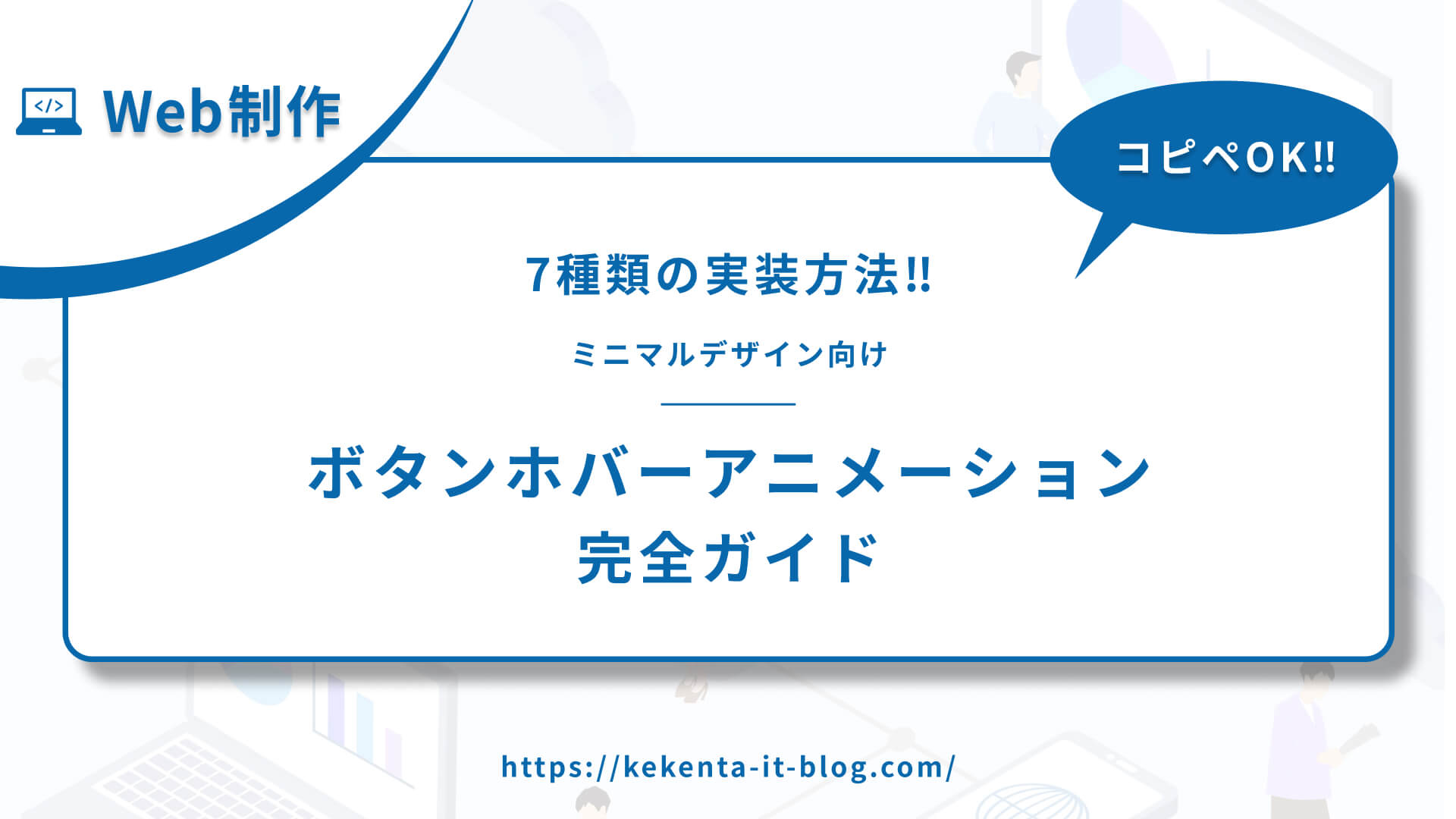
ミニマルボタンホバーアニメーション
をご紹介します。
7種類のミニマルなホバー効果を完全網羅した実装なので、いままさに「シンプルで美しいボタンを作りたい!」という方は丸っとコピペしてどうぞご活用ください!
- マイクロスケール(微細なスケール変化)
- アンダーラインスライド(下線がスライドする効果)
- ドット効果(ドットが現れる効果)
- フェード効果(フェードイン/アウト効果)
- ボーダー拡張(ボーダーが拡張する効果)
- シャドウマイクロ(微細なシャドウ変化)
- カラーフェード(色がフェードする効果)
 ケケンタ
ケケンタ特にミニマルデザインやモダンなUIには、ミニマルボタンホバーアニメーションが非常に効果的です。この記事のコードをご活用いただきWeb制作の効率化に繋がれば何よりです。
あわせて読みたい
Webアニメーションの引き出しを増やしたい人におすすめの書籍


もしプログラミング学習やお仕事で運動不足が気になっているなら
連続屈伸運動がおすすめです!
ボタンにカーソルを合わせるだけで
カウントダウンが始まるタイマーをご用意してみました!
ケケンタ無理のない範囲で、ぜひ隙間時間に屈伸運動を取り入れてみて下さい!
タイマースタート
3:00

ミニマルボタンホバーアニメーションとは
ミニマルボタンホバーアニメーションは、控えめで洗練されたホバー効果を実現するアニメーションです。過度な装飾を避け、機能性と美しさを両立させる手法です。
効果的な使用場面
適している場面
- ミニマルデザインサイト
- モダンなUI/UX
- 企業サイト
- ポートフォリオサイト
- ブログサイト
避けるべき場面
- 派手なデザインサイト
- ゲームサイト
- エンターテイメントサイト
- 過度に装飾的なサイト
実装方法の比較
| アニメーション | 難易度 | 視覚的インパクト | パフォーマンス | ブラウザ対応 |
|---|---|---|---|---|
| マイクロスケール | ⭐ | ⭐⭐ | ⭐⭐⭐⭐⭐ | ⭐⭐⭐⭐⭐ |
| アンダーラインスライド | ⭐ | ⭐⭐⭐ | ⭐⭐⭐⭐⭐ | ⭐⭐⭐⭐⭐ |
| ドット効果 | ⭐⭐ | ⭐⭐ | ⭐⭐⭐⭐⭐ | ⭐⭐⭐⭐⭐ |
| フェード効果 | ⭐ | ⭐⭐ | ⭐⭐⭐⭐⭐ | ⭐⭐⭐⭐⭐ |
| ボーダー拡張 | ⭐ | ⭐⭐⭐ | ⭐⭐⭐⭐⭐ | ⭐⭐⭐⭐⭐ |
| シャドウマイクロ | ⭐ | ⭐⭐ | ⭐⭐⭐⭐⭐ | ⭐⭐⭐⭐⭐ |
| カラーフェード | ⭐ | ⭐⭐⭐ | ⭐⭐⭐⭐⭐ | ⭐⭐⭐⭐⭐ |
マイクロスケール
① デモ
See the Pen マイクロスケール by ケケンタ (@lgshifbg-the-looper) on CodePen.
- 微細なスケール変化
- 控えめで洗練された印象
- 高いパフォーマンス
- すべてのブラウザで対応
② HTML
<div class="button-container">
  <button class="micro-scale-btn">
    <span class="btn-text">マイクロスケール</span>
  </button>
</div>
③ CSS
.button-container {
  display: flex;
  justify-content: center;
  align-items: center;
  min-height: 60vh;
  background: #fafafa;
  padding: 2rem;
}

.micro-scale-btn {
  padding: 12px 24px;
  font-size: 14px;
  font-weight: 500;
  color: #333;
  background: white;
  border: 1px solid #e0e0e0;
  border-radius: 6px;
  cursor: pointer;
  transition: all 0.2s ease;
  box-shadow: 0 1px 3px rgba(0, 0, 0, 0.1);
}

.micro-scale-btn:hover {
  transform: scale(1.02);
  box-shadow: 0 2px 6px rgba(0, 0, 0, 0.15);
  border-color: #d0d0d0;
}

.btn-text {
  display: block;
}
⑤ カスタマイズ例
/* スケール値の変更 */
.micro-scale-btn:hover {
  transform: scale(1.05);
}

/* アニメーション速度の変更 */
.micro-scale-btn {
  transition: all 0.3s ease;
}

/* 影効果の強化 */
.micro-scale-btn:hover {
  box-shadow: 0 4px 12px rgba(0, 0, 0, 0.2);
}
アンダーラインスライド
① デモ
See the Pen アンダーラインスライド by ケケンタ (@lgshifbg-the-looper) on CodePen.
- 下線がスライドする効果
- エレガントな印象
- 読みやすさを保持
- シンプルで洗練された表現
② HTML
<div class="button-container">
  <button class="underline-slide-btn">
    <span class="btn-text">アンダーラインスライド</span>
  </button>
</div>
③ CSS
.button-container {
  display: flex;
  justify-content: center;
  align-items: center;
  min-height: 60vh;
  background: #fafafa;
  padding: 2rem;
}

.underline-slide-btn {
  position: relative;
  padding: 12px 24px;
  font-size: 14px;
  font-weight: 500;
  color: #333;
  background: transparent;
  border: none;
  cursor: pointer;
  transition: color 0.3s ease;
}

.underline-slide-btn::after {
  content: '';
  position: absolute;
  bottom: 8px;
  left: 24px;
  width: 0;
  height: 2px;
  background: #333;
  transition: width 0.3s ease;
}

.underline-slide-btn:hover::after {
  width: calc(100% - 48px);
}

.underline-slide-btn:hover {
  color: #000;
}

.btn-text {
  display: block;
}
⑤ カスタマイズ例
/* 下線色の変更 */
.underline-slide-btn::after {
  background: #667eea;
}

/* 下線幅の変更 */
.underline-slide-btn::after {
  height: 3px;
}

/* アニメーション速度の変更 */
.underline-slide-btn::after {
  transition: width 0.5s ease;
}
ドット効果
① デモ
See the Pen ドット効果 by ケケンタ (@lgshifbg-the-looper) on CodePen.
- ドットが現れる効果
- ミニマルで可愛らしい印象
- 視覚的インパクト小
- 洗練された表現
② HTML
<div class="button-container">
  <button class="dot-effect-btn">
    <span class="btn-text">ドット効果</span>
  </button>
</div>
③ CSS
.button-container {
  display: flex;
  justify-content: center;
  align-items: center;
  min-height: 60vh;
  background: #fafafa;
  padding: 2rem;
}

.dot-effect-btn {
  position: relative;
  padding: 12px 24px;
  font-size: 14px;
  font-weight: 500;
  color: #333;
  background: white;
  border: 1px solid #e0e0e0;
  border-radius: 6px;
  cursor: pointer;
  transition: all 0.3s ease;
  overflow: hidden;
}

.dot-effect-btn::before {
  content: '';
  position: absolute;
  top: 50%;
  right: 12px;
  width: 4px;
  height: 4px;
  background: #333;
  border-radius: 50%;
  transform: translateY(-50%) scale(0);
  transition: transform 0.3s ease;
}

.dot-effect-btn:hover::before {
  transform: translateY(-50%) scale(1);
}

.dot-effect-btn:hover {
  background: #f8f9fa;
  border-color: #d0d0d0;
}

.btn-text {
  display: block;
}
⑤ カスタマイズ例
/* ドット色の変更 */
.dot-effect-btn::before {
  background: #667eea;
}

/* ドットサイズの変更 */
.dot-effect-btn::before {
  width: 6px;
  height: 6px;
}

/* ドット位置の変更 */
.dot-effect-btn::before {
  right: 16px;
}
フェード効果
① デモ
See the Pen フェード効果 by ケケンタ (@lgshifbg-the-looper) on CodePen.
- フェードイン/アウト効果
- 控えめで洗練された印象
- 読みやすさを保持
- シンプルな表現
② HTML
<div class="button-container">
  <button class="fade-effect-btn">
    <span class="btn-text">フェード効果</span>
  </button>
</div>
③ CSS
.button-container {
  display: flex;
  justify-content: center;
  align-items: center;
  min-height: 60vh;
  background: #fafafa;
  padding: 2rem;
}

.fade-effect-btn {
  padding: 12px 24px;
  font-size: 14px;
  font-weight: 500;
  color: #333;
  background: white;
  border: 1px solid #e0e0e0;
  border-radius: 6px;
  cursor: pointer;
  transition: all 0.3s ease;
  opacity: 0.8;
}

.fade-effect-btn:hover {
  opacity: 1;
  background: #f8f9fa;
  border-color: #d0d0d0;
}

.btn-text {
  display: block;
}
⑤ カスタマイズ例
/* 透明度の変更 */
.fade-effect-btn {
  opacity: 0.7;
}

.fade-effect-btn:hover {
  opacity: 1;
}

/* アニメーション速度の変更 */
.fade-effect-btn {
  transition: all 0.5s ease;
}

/* 背景色の変更 */
.fade-effect-btn:hover {
  background: #e9ecef;
}
ボーダー拡張
① デモ
See the Pen ボーダー拡張 by ケケンタ (@lgshifbg-the-looper) on CodePen.
- ボーダーが拡張する効果
- エレガントな印象
- 視覚的インパクト中
- 洗練された表現
② HTML
<div class="button-container">
  <button class="border-expand-btn">
    <span class="btn-text">ボーダー拡張</span>
  </button>
</div>
③ CSS
.button-container {
  display: flex;
  justify-content: center;
  align-items: center;
  min-height: 60vh;
  background: #fafafa;
  padding: 2rem;
}

.border-expand-btn {
  position: relative;
  padding: 12px 24px;
  font-size: 14px;
  font-weight: 500;
  color: #333;
  background: white;
  border: 1px solid #e0e0e0;
  border-radius: 6px;
  cursor: pointer;
  transition: all 0.3s ease;
  overflow: hidden;
}

.border-expand-btn::before {
  content: '';
  position: absolute;
  top: 0;
  left: 0;
  width: 0;
  height: 100%;
  background: #333;
  transition: width 0.3s ease;
  z-index: -1;
}

.border-expand-btn:hover::before {
  width: 100%;
}

.border-expand-btn:hover {
  border-color: #333;
}

.btn-text {
  display: block;
  position: relative;
  z-index: 1;
}
⑤ カスタマイズ例
/* 拡張色の変更 */
.border-expand-btn::before {
  background: #667eea;
}

/* アニメーション速度の変更 */
.border-expand-btn::before {
  transition: width 0.5s ease;
}

/* 拡張方向の変更 */
.border-expand-btn::before {
  width: 100%;
  height: 0;
  top: auto;
  bottom: 0;
}

.border-expand-btn:hover::before {
  height: 100%;
  width: 100%;
}
シャドウマイクロ
① デモ
See the Pen シャドウマイクロ by ケケンタ (@lgshifbg-the-looper) on CodePen.
- 微細なシャドウ変化
- 控えめで洗練された印象
- 読みやすさを保持
- シンプルな表現
② HTML
<div class="button-container">
  <button class="shadow-micro-btn">
    <span class="btn-text">シャドウマイクロ</span>
  </button>
</div>
③ CSS
.button-container {
  display: flex;
  justify-content: center;
  align-items: center;
  min-height: 60vh;
  background: #fafafa;
  padding: 2rem;
}

.shadow-micro-btn {
  padding: 12px 24px;
  font-size: 14px;
  font-weight: 500;
  color: #333;
  background: white;
  border: 1px solid #e0e0e0;
  border-radius: 6px;
  cursor: pointer;
  transition: all 0.3s ease;
  box-shadow: 0 1px 3px rgba(0, 0, 0, 0.1);
}

.shadow-micro-btn:hover {
  box-shadow: 0 3px 8px rgba(0, 0, 0, 0.15);
  transform: translateY(-1px);
}

.btn-text {
  display: block;
}
⑤ カスタマイズ例
/* シャドウ強度の変更 */
.shadow-micro-btn:hover {
  box-shadow: 0 4px 12px rgba(0, 0, 0, 0.2);
}

/* 浮き上がり幅の変更 */
.shadow-micro-btn:hover {
  transform: translateY(-2px);
}

/* アニメーション速度の変更 */
.shadow-micro-btn {
  transition: all 0.5s ease;
}
カラーフェード
① デモ
===== ここにCode pen設置 ======
See the Pen カラーフェード by ケケンタ (@lgshifbg-the-looper) on CodePen.
- 色がフェードする効果
- エレガントな印象
- 視覚的インパクト中
- 洗練された表現
② HTML
<div class="button-container">
  <button class="color-fade-btn">
    <span class="btn-text">カラーフェード</span>
  </button>
</div>
③ CSS
.button-container {
  display: flex;
  justify-content: center;
  align-items: center;
  min-height: 60vh;
  background: #fafafa;
  padding: 2rem;
}

.color-fade-btn {
  padding: 12px 24px;
  font-size: 14px;
  font-weight: 500;
  color: #333;
  background: white;
  border: 1px solid #e0e0e0;
  border-radius: 6px;
  cursor: pointer;
  transition: all 0.3s ease;
}

.color-fade-btn:hover {
  color: #667eea;
  border-color: #667eea;
  background: rgba(102, 126, 234, 0.05);
}

.btn-text {
  display: block;
}
⑤ カスタマイズ例
/* フェード色の変更 */
.color-fade-btn:hover {
  color: #ff6b6b;
  border-color: #ff6b6b;
  background: rgba(255, 107, 107, 0.05);
}

/* アニメーション速度の変更 */
.color-fade-btn {
  transition: all 0.5s ease;
}

/* 背景色の強度変更 */
.color-fade-btn:hover {
  background: rgba(102, 126, 234, 0.1);
}
まとめ
今回ご紹介したミニマルボタンホバーアニメーションは、Webサイトのユーザーエクスペリエンスを向上させる重要な要素です。
実装のコツ
- 適切なアニメーション時間(200ms〜300ms)
- 控えめな効果の使用
- モバイルデバイスでの動作確認
- アクセシビリティの配慮
- パフォーマンスの最適化
避けるべきポイント
- 過度に派手なアニメーション
- 長すぎるアニメーション時間
- 読みにくい色の組み合わせ
- パフォーマンスを考慮しない実装
- 過度な使用
おすすめの組み合わせ
- シンプルなサイト: マイクロスケール、フェード効果
- モダンなサイト: アンダーラインスライド、カラーフェード
- プレミアムサイト: ボーダー拡張、シャドウマイクロ
ケケンタ特にミニマルデザインやモダンなUIでは、ミニマルボタンホバーアニメーションがユーザーエクスペリエンスを大きく左右します。この記事のコードをご活用いただき、より魅力的なWebサイトの制作に繋がれば何よりです。
あわせて読みたい
もっと効率的にWeb制作を学びたい方へ
Web制作の学習は楽しいものですが、一人で進めていると「これで合っているのかな?」と不安になることもありますよね。
僕も独学でWeb制作を学んできましたが、今思うと「もっと早く知りたかった」と思うことがたくさんあります。
特に以下のような方は、一度プログラミングスクールの利用を検討してみることをおすすめします。
- 学習の方向性に迷いがある方
- 効率的にスキルを身につけたい方
- 転職や副業でWeb制作を活用したい方
- 挫折経験がある方
忍者CODEなら、業界最安値で24時間サポート付きの学習環境が整っています。

関連記事
基本的なアニメーション
スクロール系
メニュー・タブ・ナビゲーション
\どれを読むか迷ったときのおすすめ‼/
フォーム・UI要素
\どれを読むか迷ったときのおすすめ‼/
ボタン・アイコン
\どれを読むか迷ったときのおすすめ‼/
テキスト
\どれを読むか迷ったときのおすすめ‼/


コメント