
 ケケンタ
ケケンタアイコン付きボタンのホバーアニメーションを実装したい……
ケケンタアイコンが動く魅力的なボタンデザインを作りたい……
今回はこのようなお悩みをお持ちの方へ向けて
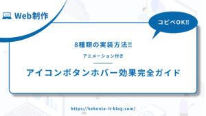
Web制作において人気の高いアニメーション効果
アニメーション付きアイコンボタンホバー効果
をご紹介します。
- アイコンズーム(アイコンが拡大する効果)
- アイコン回転
- アイコンカラー変化
- アイコンスライド
- アイコンフリップ
- アイコンパルス
- アイコンストローク
- アイコン変形
 ケケンタ
ケケンタ特にナビゲーションボタンやソーシャルメディアボタンには、アニメーション付きアイコンボタンホバー効果が非常に効果的です。この記事のコードをご活用いただきWeb制作の効率化に繋がれば何よりです。
なお、今回ご紹介するアニメーションはCSSのみで実現しているので、軽量な実装が可能です。
あわせて読みたい
Webアニメーションの引き出しを増やしたい人におすすめの書籍


もしプログラミング学習やお仕事で運動不足が気になっているなら
連続屈伸運動がおすすめです!
ボタンにカーソルを合わせるだけで
カウントダウンが始まるタイマーをご用意してみました!
ケケンタ無理のない範囲で、ぜひ隙間時間に屈伸運動を取り入れてみて下さい!
タイマースタート
3:00

アニメーション付きアイコンボタンホバー効果とは
アニメーション付きアイコンボタンホバー効果は、ボタン内のアイコンに動的な変化を与えるアニメーションです。ユーザーの注目を集め、インタラクションを促進するための手法です。
効果的な使用場面
適している場面
- ナビゲーションボタン
- ソーシャルメディアボタン
- アクションボタン
- ツールボタン
- メニューボタン
避けるべき場面
- 過度に複雑なアニメーション
- 読みやすさを重視する場面
- アクセシビリティを重視する場面
- 過度に使用した場合
実装方法の比較
| アニメーション | 難易度 | 視覚的インパクト | パフォーマンス | ブラウザ対応 |
|---|---|---|---|---|
| アイコンズーム | ⭐ | ⭐⭐⭐ | ⭐⭐⭐⭐⭐ | ⭐⭐⭐⭐⭐ |
| アイコン回転 | ⭐ | ⭐⭐⭐ | ⭐⭐⭐⭐⭐ | ⭐⭐⭐⭐⭐ |
| アイコンカラー変化 | ⭐ | ⭐⭐ | ⭐⭐⭐⭐⭐ | ⭐⭐⭐⭐⭐ |
| アイコンスライド | ⭐⭐ | ⭐⭐⭐⭐ | ⭐⭐⭐⭐ | ⭐⭐⭐⭐⭐ |
| アイコンフリップ | ⭐⭐ | ⭐⭐⭐⭐ | ⭐⭐⭐⭐ | ⭐⭐⭐⭐ |
| アイコンパルス | ⭐ | ⭐⭐⭐ | ⭐⭐⭐⭐⭐ | ⭐⭐⭐⭐⭐ |
| アイコンストローク | ⭐⭐ | ⭐⭐⭐ | ⭐⭐⭐⭐ | ⭐⭐⭐⭐ |
| アイコン変形 | ⭐⭐ | ⭐⭐⭐⭐ | ⭐⭐⭐⭐ | ⭐⭐⭐⭐ |
アイコンズーム
① デモ
See the Pen アイコンズーム by ケケンタ (@lgshifbg-the-looper) on CodePen.
- アイコンが拡大する効果
- シンプルで効果的
- 視覚的インパクト中
- すべてのブラウザで対応
② HTML
<div class="button-container">
  <button class="icon-zoom-btn">
    <span class="btn-icon">→</span>
    <span class="btn-text">アイコンズーム</span>
  </button>
</div>
③ CSS
.button-container {
  display: flex;
  justify-content: center;
  align-items: center;
  min-height: 60vh;
  background: #f8f9fa;
  padding: 2rem;
}

.icon-zoom-btn {
  display: flex;
  align-items: center;
  gap: 10px;
  padding: 15px 30px;
  font-size: 16px;
  font-weight: 600;
  color: white;
  background: linear-gradient(135deg, #667eea 0%, #764ba2 100%);
  border: none;
  border-radius: 8px;
  cursor: pointer;
  transition: all 0.3s ease;
  box-shadow: 0 4px 15px rgba(102, 126, 234, 0.3);
}

.btn-icon {
  font-size: 18px;
  transition: transform 0.3s ease;
}

.icon-zoom-btn:hover {
  transform: translateY(-2px);
  box-shadow: 0 8px 25px rgba(102, 126, 234, 0.4);
}

.icon-zoom-btn:hover .btn-icon {
  transform: scale(1.5);
}

.btn-text {
  display: block;
}
④ カスタマイズ例
/* ズーム倍率の変更 */
.icon-zoom-btn:hover .btn-icon {
  transform: scale(2);
}

/* ズーム速度の変更 */
.btn-icon {
  transition: transform 0.5s ease;
}

/* アイコンサイズの変更 */
.btn-icon {
  font-size: 20px;
}
アイコン回転
① デモ
See the Pen アイコン回転 by ケケンタ (@lgshifbg-the-looper) on CodePen.
- アイコンが回転する効果
- シンプルで効果的
- 視覚的インパクト中
- すべてのブラウザで対応
② HTML
<div class="button-container">
  <button class="icon-rotate-btn">
    <span class="btn-icon">↻</span>
    <span class="btn-text">アイコン回転</span>
  </button>
</div>
③ CSS
.button-container {
  display: flex;
  justify-content: center;
  align-items: center;
  min-height: 60vh;
  background: #f8f9fa;
  padding: 2rem;
}

.icon-rotate-btn {
  display: flex;
  align-items: center;
  gap: 10px;
  padding: 15px 30px;
  font-size: 16px;
  font-weight: 600;
  color: white;
  background: linear-gradient(135deg, #667eea 0%, #764ba2 100%);
  border: none;
  border-radius: 8px;
  cursor: pointer;
  transition: all 0.3s ease;
  box-shadow: 0 4px 15px rgba(102, 126, 234, 0.3);
}

.btn-icon {
  font-size: 18px;
  transition: transform 0.3s ease;
}

.icon-rotate-btn:hover {
  transform: translateY(-2px);
  box-shadow: 0 8px 25px rgba(102, 126, 234, 0.4);
}

.icon-rotate-btn:hover .btn-icon {
  transform: rotate(360deg);
}

.btn-text {
  display: block;
}
④ カスタマイズ例
/* 回転角度の変更 */
.icon-rotate-btn:hover .btn-icon {
  transform: rotate(180deg);
}

/* 回転速度の変更 */
.btn-icon {
  transition: transform 0.6s ease;
}

/* 回転方向の変更 */
.icon-rotate-btn:hover .btn-icon {
  transform: rotate(-360deg);
}
アイコンカラー変化
① デモ
See the Pen アイコンカラー変化 by ケケンタ (@lgshifbg-the-looper) on CodePen.
- アイコンの色が変化する効果
- シンプルで効果的
- 視覚的インパクト小
- すべてのブラウザで対応
② HTML
<div class="button-container">
  <button class="icon-color-btn">
    <span class="btn-icon">❤</span>
    <span class="btn-text">アイコンカラー変化</span>
  </button>
</div>
③ CSS
.button-container {
  display: flex;
  justify-content: center;
  align-items: center;
  min-height: 60vh;
  background: #f8f9fa;
  padding: 2rem;
}

.icon-color-btn {
  display: flex;
  align-items: center;
  gap: 10px;
  padding: 15px 30px;
  font-size: 16px;
  font-weight: 600;
  color: white;
  background: linear-gradient(135deg, #667eea 0%, #764ba2 100%);
  border: none;
  border-radius: 8px;
  cursor: pointer;
  transition: all 0.3s ease;
  box-shadow: 0 4px 15px rgba(102, 126, 234, 0.3);
}

.btn-icon {
  font-size: 18px;
  transition: color 0.3s ease;
}

.icon-color-btn:hover {
  transform: translateY(-2px);
  box-shadow: 0 8px 25px rgba(102, 126, 234, 0.4);
}

.icon-color-btn:hover .btn-icon {
  color:rgb(240, 63, 63);
}

.btn-text {
  display: block;
}
④ カスタマイズ例
/* カラー変更 */
.icon-color-btn:hover .btn-icon {
  color: #ff6b6b;
}

/* カラー変化速度の変更 */
.btn-icon {
  transition: color 0.5s ease;
}

/* 複数カラーの変化 */
.icon-color-btn:hover .btn-icon {
  color: #4ecdc4;
}
アイコンスライド
① デモ
See the Pen アイコンスライド by ケケンタ (@lgshifbg-the-looper) on CodePen.
- アイコンがスライドする効果
- 動的な表現
- 視覚的インパクト大
- モダンな印象
② HTML
<div class="button-container">
  <button class="icon-slide-btn">
    <span class="btn-icon">→</span>
    <span class="btn-text">アイコンスライド</span>
  </button>
</div>
③ CSS
.button-container {
  display: flex;
  justify-content: center;
  align-items: center;
  min-height: 60vh;
  background: #f8f9fa;
  padding: 2rem;
}

.icon-slide-btn {
  display: flex;
  align-items: center;
  gap: 10px;
  padding: 15px 30px;
  font-size: 16px;
  font-weight: 600;
  color: white;
  background: linear-gradient(135deg, #667eea 0%, #764ba2 100%);
  border: none;
  border-radius: 8px;
  cursor: pointer;
  transition: all 0.3s ease;
  box-shadow: 0 4px 15px rgba(102, 126, 234, 0.3);
  overflow: hidden;
}

.btn-icon {
  font-size: 18px;
  transition: transform 0.3s ease;
}

.icon-slide-btn:hover {
  transform: translateY(-2px);
  box-shadow: 0 8px 25px rgba(102, 126, 234, 0.4);
}

.icon-slide-btn:hover .btn-icon {
  transform: translateX(10px);
}

.btn-text {
  display: block;
}
④ カスタマイズ例
/* スライド距離の変更 */
.icon-slide-btn:hover .btn-icon {
  transform: translateX(20px);
}

/* スライド方向の変更 */
.icon-slide-btn:hover .btn-icon {
  transform: translateY(-10px);
}

/* スライド速度の変更 */
.btn-icon {
  transition: transform 0.5s ease;
}
アイコンフリップ
① デモ
See the Pen アイコンフリップ by ケケンタ (@lgshifbg-the-looper) on CodePen.
- アイコンがフリップする効果
- 立体的な表現
- 視覚的インパクト大
- インタラクティブな印象
② HTML
<div class="button-container">
  <button class="icon-flip-btn">
    <div class="icon-container">
      <span class="btn-icon-front">→</span>
      <span class="btn-icon-back">←</span>
    </div>
    <span class="btn-text">アイコンフリップ</span>
  </button>
</div>
③ CSS
.button-container {
  display: flex;
  justify-content: center;
  align-items: center;
  min-height: 60vh;
  background: #f8f9fa;
  padding: 2rem;
}

.icon-flip-btn {
  display: flex;
  align-items: center;
  gap: 10px;
  padding: 15px 30px;
  font-size: 16px;
  font-weight: 600;
  color: white;
  background: linear-gradient(135deg, #667eea 0%, #764ba2 100%);
  border: none;
  border-radius: 8px;
  cursor: pointer;
  transition: all 0.3s ease;
  box-shadow: 0 4px 15px rgba(102, 126, 234, 0.3);
}

.icon-container {
  position: relative;
  width: 18px;
  height: 18px;
  perspective: 100px;
}

.btn-icon-front,
.btn-icon-back {
  position: absolute;
  top: 0;
  left: 0;
  width: 100%;
  height: 100%;
  display: flex;
  align-items: center;
  justify-content: center;
  font-size: 18px;
  transition: transform 0.3s ease;
  backface-visibility: hidden;
}

.btn-icon-back {
  transform: rotateY(180deg);
}

.icon-flip-btn:hover {
  transform: translateY(-2px);
  box-shadow: 0 8px 25px rgba(102, 126, 234, 0.4);
}

.icon-flip-btn:hover .btn-icon-front {
  transform: rotateY(180deg);
}

.icon-flip-btn:hover .btn-icon-back {
  transform: rotateY(0deg);
}

.btn-text {
  display: block;
}
④ カスタマイズ例
/* フリップ速度の変更 */
.btn-icon-front,
.btn-icon-back {
  transition: transform 0.6s ease;
}

/* フリップ軸の変更 */
.btn-icon-back {
  transform: rotateX(180deg);
}

.icon-flip-btn:hover .btn-icon-front {
  transform: rotateX(180deg);
}

.icon-flip-btn:hover .btn-icon-back {
  transform: rotateX(0deg);
}
アイコンパルス
① デモ
See the Pen アイコンパルス by ケケンタ (@lgshifbg-the-looper) on CodePen.
- アイコンがパルスする効果
- 動的な表現
- 視覚的インパクト中
- 注目を集める効果
② HTML
<div class="button-container">
  <button class="icon-pulse-btn">
    <span class="btn-icon">💛</span>
    <span class="btn-text">アイコンパルス</span>
  </button>
</div>
③ CSS
.button-container {
  display: flex;
  justify-content: center;
  align-items: center;
  min-height: 60vh;
  background: #f8f9fa;
  padding: 2rem;
}

.icon-pulse-btn {
  display: flex;
  align-items: center;
  gap: 10px;
  padding: 15px 30px;
  font-size: 16px;
  font-weight: 600;
  color: white;
  background: linear-gradient(135deg, #667eea 0%, #764ba2 100%);
  border: none;
  border-radius: 8px;
  cursor: pointer;
  transition: all 0.3s ease;
  box-shadow: 0 4px 15px rgba(102, 126, 234, 0.3);
}

.btn-icon {
  font-size: 18px;
  transition: transform 0.3s ease;
}

.icon-pulse-btn:hover {
  transform: translateY(-2px);
  box-shadow: 0 8px 25px rgba(102, 126, 234, 0.4);
}

.icon-pulse-btn:hover .btn-icon {
  animation: pulse 1s infinite;
}

@keyframes pulse {
  0% {
    transform: scale(1);
  }
  50% {
    transform: scale(1.3);
  }
  100% {
    transform: scale(1);
  }
}

.btn-text {
  display: block;
}
④ カスタマイズ例
/* パルス速度の変更 */
.icon-pulse-btn:hover .btn-icon {
  animation: pulse 0.5s infinite;
}

/* パルスサイズの変更 */
@keyframes pulse {
  0% {
    transform: scale(1);
  }
  50% {
    transform: scale(1.5);
  }
  100% {
    transform: scale(1);
  }
}
アイコンストローク
① デモ
See the Pen アイコンストローク by ケケンタ (@lgshifbg-the-looper) on CodePen.
- アイコンのストロークが変化する効果
- 洗練された表現
- 視覚的インパクト中
- モダンな印象
② HTML
<div class="button-container">
  <button class="icon-stroke-btn">
    <svg class="btn-icon" width="18" height="18" viewBox="0 0 24 24" fill="none" stroke="currentColor" stroke-width="2">
      <path d="M5 12h14M12 5l7 7-7 7"/>
    </svg>
    <span class="btn-text">アイコンストローク</span>
  </button>
</div>
③ CSS
.button-container {
  display: flex;
  justify-content: center;
  align-items: center;
  min-height: 60vh;
  background: #f8f9fa;
  padding: 2rem;
}

.icon-stroke-btn {
  display: flex;
  align-items: center;
  gap: 10px;
  padding: 15px 30px;
  font-size: 16px;
  font-weight: 600;
  color: white;
  background: linear-gradient(135deg, #667eea 0%, #764ba2 100%);
  border: none;
  border-radius: 8px;
  cursor: pointer;
  transition: all 0.3s ease;
  box-shadow: 0 4px 15px rgba(102, 126, 234, 0.3);
}

.btn-icon {
  transition: all 0.3s ease;
}

.icon-stroke-btn:hover {
  transform: translateY(-2px);
  box-shadow: 0 8px 25px rgba(102, 126, 234, 0.4);
}

.icon-stroke-btn:hover .btn-icon {
  stroke: #ffd700;
  stroke-width: 3;
  transform: scale(1.2);
}

.btn-text {
  display: block;
}
④ カスタマイズ例
/* ストローク色の変更 */
.icon-stroke-btn:hover .btn-icon {
  stroke: #ff6b6b;
}

/* ストローク幅の変更 */
.icon-stroke-btn:hover .btn-icon {
  stroke-width: 4;
}

/* アニメーション速度の変更 */
.btn-icon {
  transition: all 0.5s ease;
}
アイコン変形
① デモ
See the Pen アイコン変形 by ケケンタ (@lgshifbg-the-looper) on CodePen.
- アイコンが変形する効果
- 動的な表現
- 視覚的インパクト大
- インタラクティブな印象
② HTML
<div class="button-container">
  <button class="icon-morph-btn">
    <span class="btn-icon">☰</span>
    <span class="btn-text">アイコン変形</span>
  </button>
</div>
③ CSS
.button-container {
  display: flex;
  justify-content: center;
  align-items: center;
  min-height: 60vh;
  background: #f8f9fa;
  padding: 2rem;
}

.icon-morph-btn {
  display: flex;
  align-items: center;
  gap: 10px;
  padding: 15px 30px;
  font-size: 16px;
  font-weight: 600;
  color: white;
  background: linear-gradient(135deg, #667eea 0%, #764ba2 100%);
  border: none;
  border-radius: 8px;
  cursor: pointer;
  transition: all 0.3s ease;
  box-shadow: 0 4px 15px rgba(102, 126, 234, 0.3);
}

.btn-icon {
  font-size: 18px;
  transition: all 0.3s ease;
}

.icon-morph-btn:hover {
  transform: translateY(-2px);
  box-shadow: 0 8px 25px rgba(102, 126, 234, 0.4);
}

.icon-morph-btn:hover .btn-icon {
  transform: rotate(90deg) scale(1.2);
  color: #ffd700;
}

.btn-text {
  display: block;
}
④ カスタマイズ例
/* 変形角度の変更 */
.icon-morph-btn:hover .btn-icon {
  transform: rotate(180deg) scale(1.2);
}

/* 変形速度の変更 */
.btn-icon {
  transition: all 0.6s ease;
}

/* 変形色の変更 */
.icon-morph-btn:hover .btn-icon {
  color: #ff6b6b;
}
まとめ
今回ご紹介したアニメーション付きアイコンボタンホバー効果は、Webサイトのユーザーエクスペリエンスを向上させる重要な要素です。
実装のコツ
- 適切なアニメーション時間(300ms〜500ms)
- スムーズなイージング関数の使用
- モバイルデバイスでの動作確認
- アクセシビリティの配慮
- パフォーマンスの最適化
避けるべきポイント
- 過度に複雑なアニメーション
- 長すぎるアニメーション時間
- 読みにくい色の組み合わせ
- パフォーマンスを考慮しない実装
- 過度な使用
おすすめの組み合わせ
- ナビゲーションボタン: アイコンズーム、アイコン回転
- ソーシャルメディアボタン: アイコンカラー変化、アイコンパルス
- アクションボタン: アイコンスライド、アイコンフリップ
ケケンタ特にナビゲーションボタンやソーシャルメディアボタンでは、アニメーション付きアイコンボタンホバー効果がユーザーエクスペリエンスを大きく左右します。この記事のコードをご活用いただき、より魅力的なWebサイトの制作に繋がれば何よりです。
あわせて読みたい
もっと効率的にWeb制作を学びたい方へ
Web制作の学習は楽しいものですが、一人で進めていると「これで合っているのかな?」と不安になることもありますよね。
僕も独学でWeb制作を学んできましたが、今思うと「もっと早く知りたかった」と思うことがたくさんあります。
特に以下のような方は、一度プログラミングスクールの利用を検討してみることをおすすめします。
- 学習の方向性に迷いがある方
- 効率的にスキルを身につけたい方
- 転職や副業でWeb制作を活用したい方
- 挫折経験がある方
忍者CODEなら、業界最安値で24時間サポート付きの学習環境が整っています。

関連記事
基本的なアニメーション
スクロール系
メニュー・タブ・ナビゲーション
\どれを読むか迷ったときのおすすめ‼/
フォーム・UI要素
\どれを読むか迷ったときのおすすめ‼/
ボタン・アイコン
\どれを読むか迷ったときのおすすめ‼/
テキスト
\どれを読むか迷ったときのおすすめ‼/


コメント